E-commerce homepage best practices: how to build a homepage that converts

A strong e-commerce homepage is one of the most important assets of your online store. Many visitors land directly on your homepage from ads, social media, email campaigns, or search engines — but the homepage is not meant to be browsed endlessly. Its real job is to guide visitors smoothly toward product pages and help them understand, within seconds, what you sell, who it’s for, and why they should buy from you.
A poorly structured homepage increases bounce rate, wastes marketing spend, and may even weaken your store’s visibility in search engines. While the exact impact of bounce rate on SEO is debated, one thing is certain: a homepage that fails to engage users will never help rankings — or sales.
This guide gives you practical, proven principles to help you design an e-commerce homepage that converts and supports long-term growth.
Guide your visitors — never let them feel lost
A confused visitor is a frustrated visitor. Clear guidance is essential throughout your store, but nowhere is it more critical than on the homepage.
The two most important guiding elements are:
- Navigation menus
- CTAs (Call to Action)
A CTA is a visually distinct button or link designed to move visitors forward. Its wording and destination depend entirely on your business goals and audience.
Ask yourself one simple question when designing CTAs: “What is the single most important thing my visitor should do next?”
That action could be:
- Pre-ordering a new product
- Viewing seasonal offers
- Exploring bestsellers or new arrivals
Use large, full-width sections or strong product highlights — but keep the homepage clean. Too many CTAs overwhelm users and reduce clarity instead of improving it.
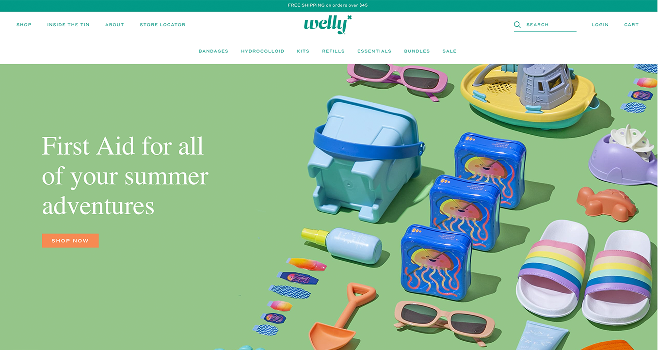
Welly’s online store features a clear and highly visible CTA.
Navigation matters more than you think
Your menu structure directly affects conversion rates. According to research by Baymard Institute, over-categorization is still the single biggest navigation problem in e-commerce.
Poor category structures don’t just cause visitors to leave — they can damage brand trust.
Best practices for e-commerce menus:
- Avoid grouping products purely by type — use filters instead
- Limit top-level categories to 10 or fewer
- Make main categories clickable
- Test, iterate, and refine continuously
Well-designed navigation helps customers find products faster — and faster discovery leads directly to higher sales.
Target the right message to the right audience
Your homepage must instantly answer three questions:
- What do you sell?
- Who is it for?
- Why is it right for me?
If visitors can’t figure this out quickly, they will leave.
To clarify messaging, it helps to understand customer awareness levels described by Eugene M. Schwartz:
- Unaware – not aware of a problem
- Problem Aware – aware of a problem, not the solution
- Solution Aware – aware solutions exist
- Product Aware – aware of specific products
- Most Aware – ready to buy
People buy emotionally and justify logically. Your homepage message should resonate with existing feelings — not invent new ones.
Use real customer language whenever possible. Reviews, testimonials, and direct feedback are gold. If customers describe your product in a certain way, mirror that language.
Messaging examples by awareness level
Most aware
Promote offers directly. This works best for well-known brands with large audiences.
Example: limited-time discounts or exclusive bundles.
Product aware
Focus on why your product is the best choice. What makes it superior?
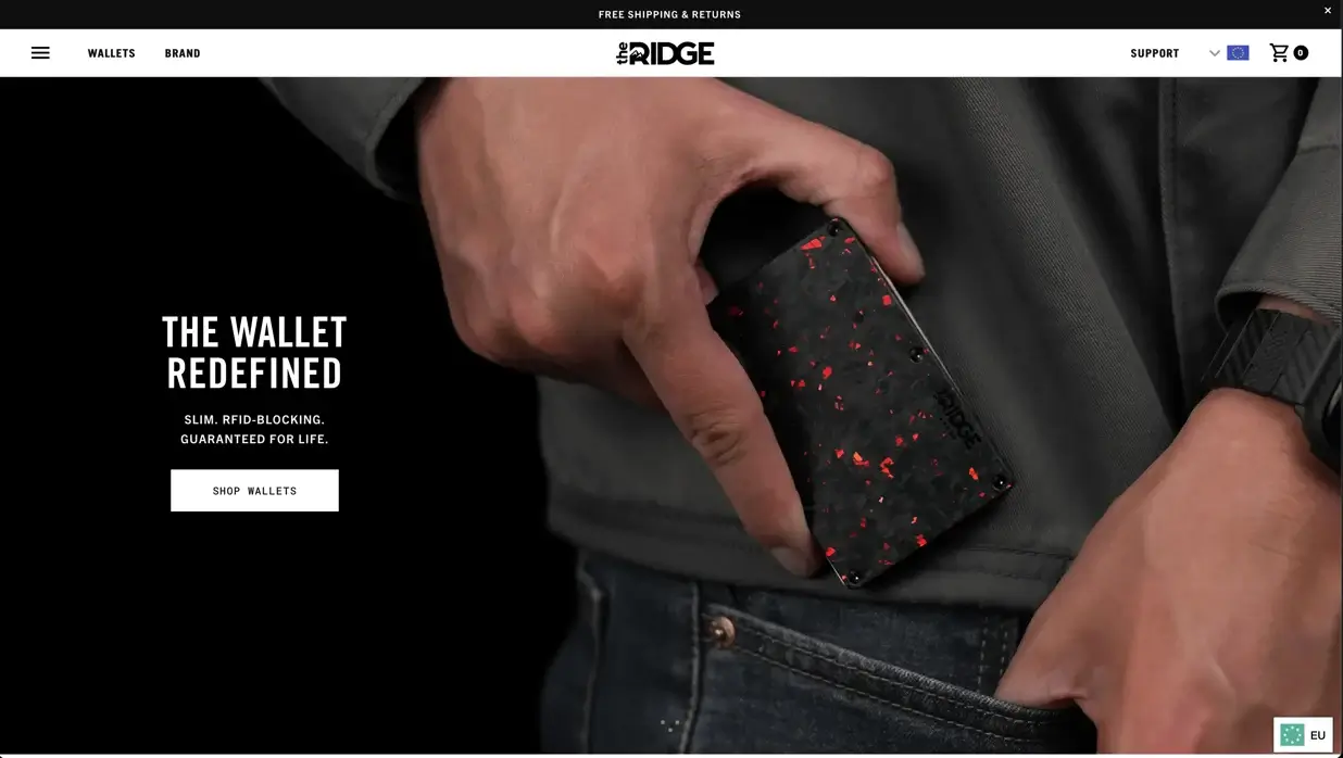
Ridge is a strong example of product-focused messaging.
Solution aware
Present your product as the answer to a known problem — show the outcome clearly.
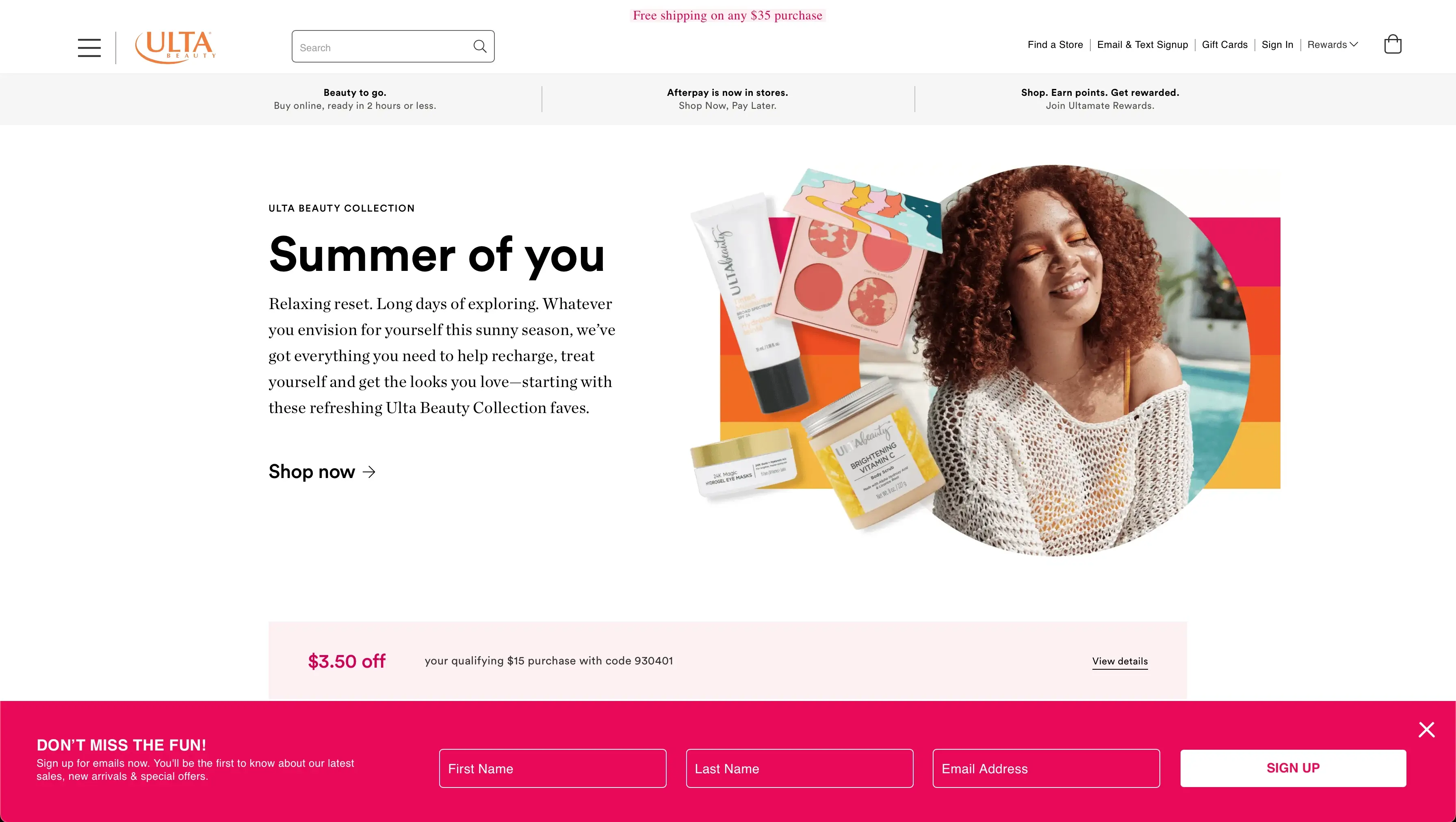
Ulta Beauty often uses this approach effectively.
Problem aware
Help visitors recognize the problem first, then amplify it, then solve it (Problem–Agitate–Solve).
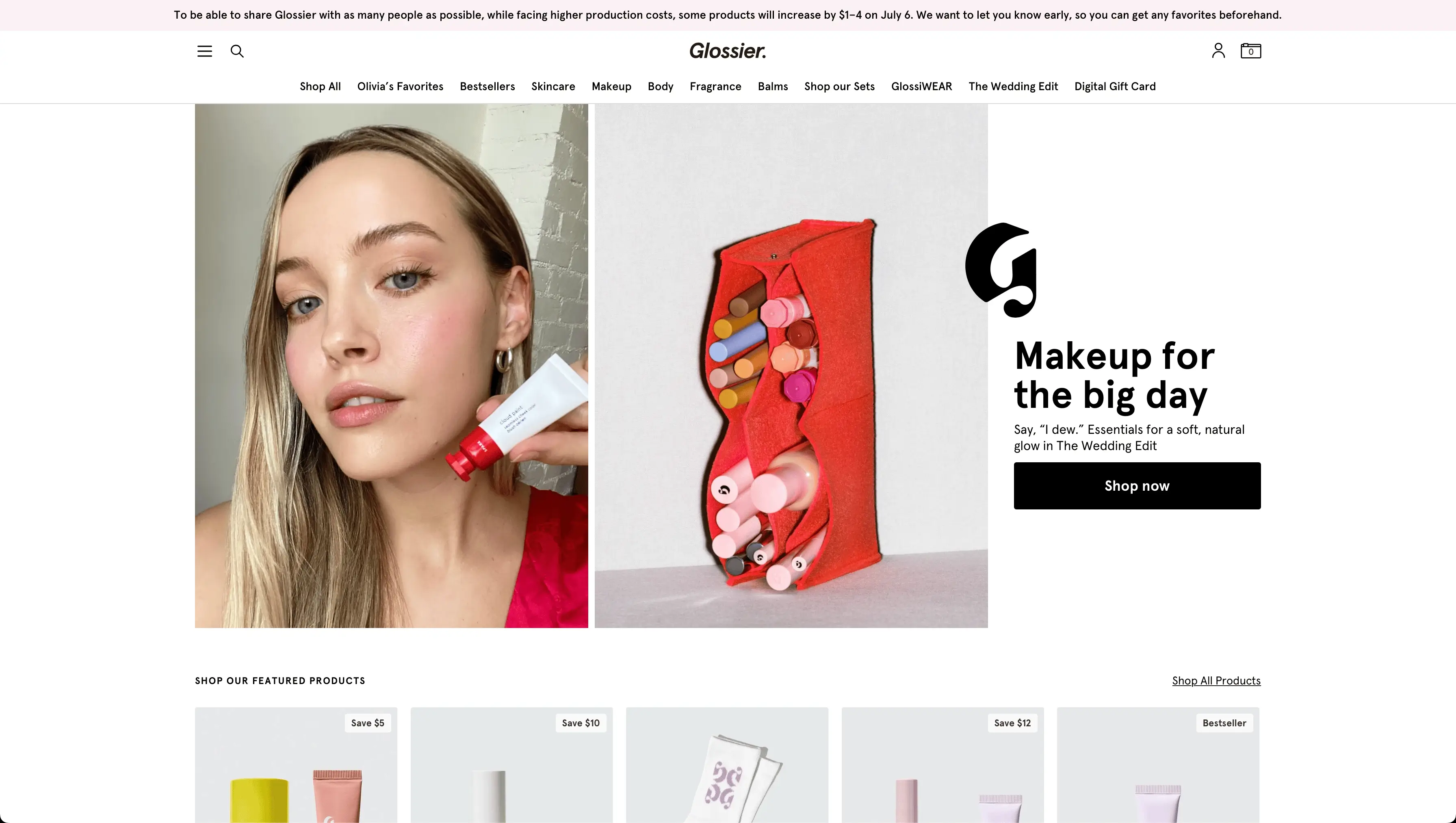
Glossier excels at this style.
Unaware
Speak to the market, not the product. Build curiosity and relevance before benefits.
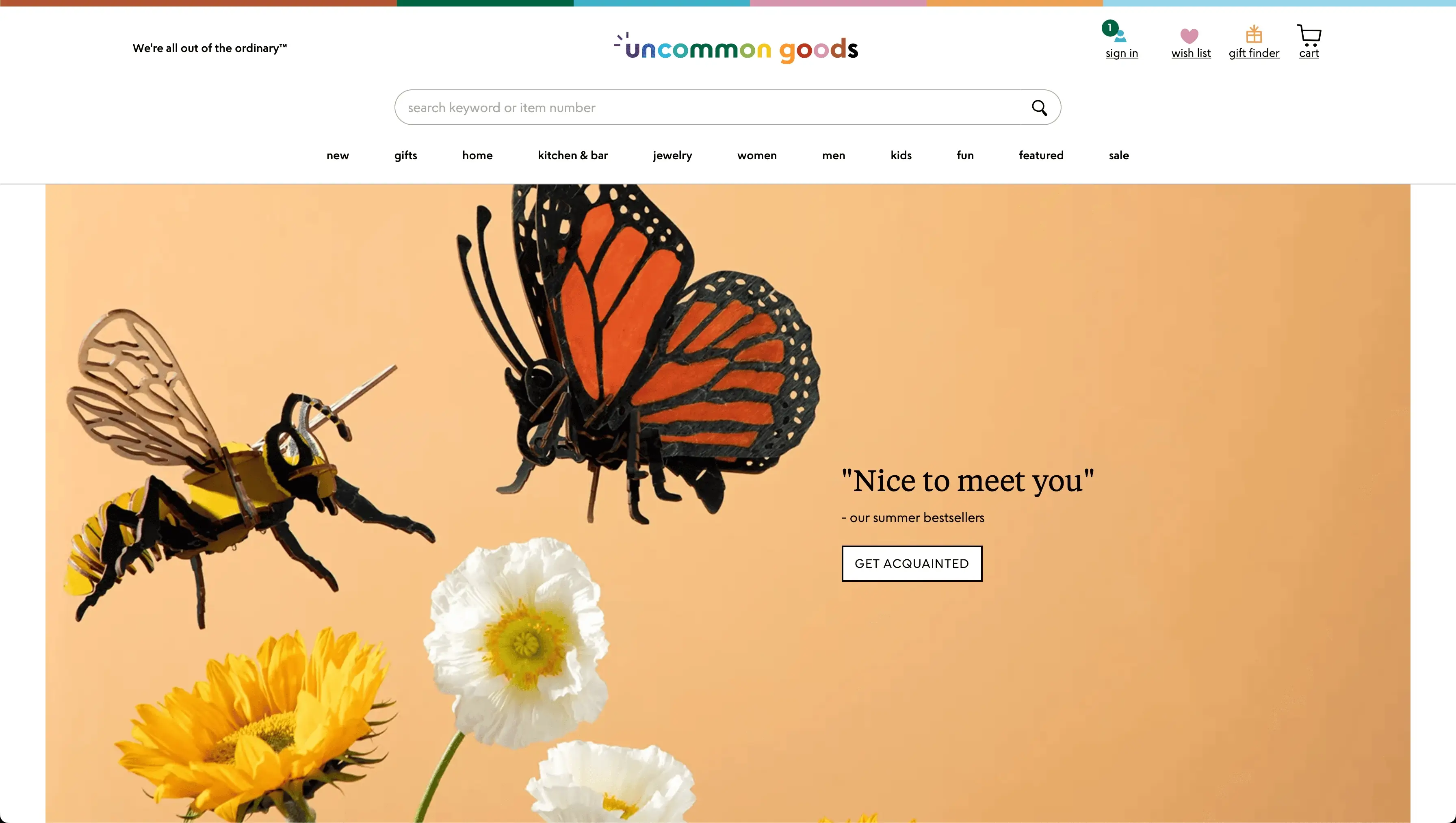
Uncommon Goods is a great example.
The hero image: your most important visual asset
The hero image — the full-width image at the top of your homepage — is the single most important visual element on your site. Research suggests you have as little as 50 milliseconds to make a first impression.
Your hero image should reinforce your value proposition and guide attention toward the CTA.
Common hero image types:
- Product image
- Contextual (lifestyle) image
- Famous founder image
- Abstract / non-contextual image (generally discouraged)
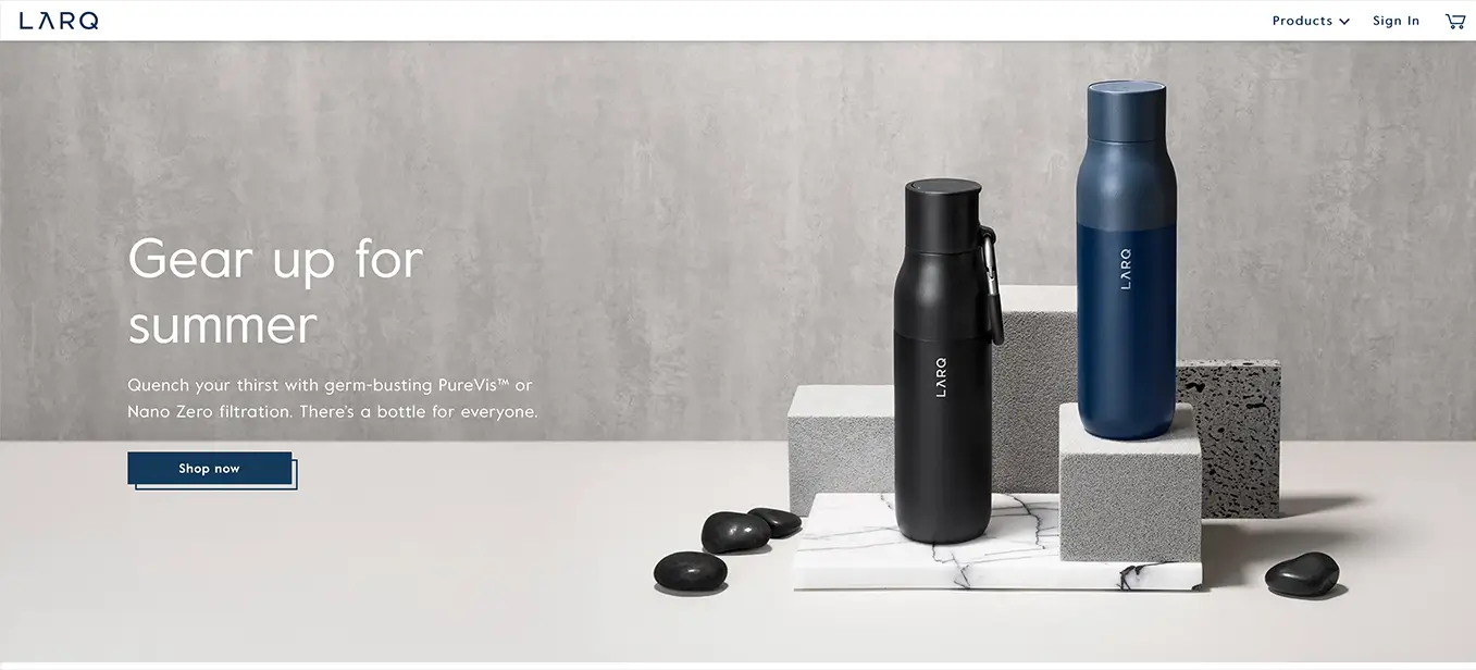
LARQ uses clean product-focused hero images effectively, while lifestyle images show customers how products fit into real life.
Avoid images that add no context or confuse the message. If the image doesn’t help explain what you sell or why it matters, it’s hurting conversion.
How to build a high-impact hero image
Use these persuasion factors as guidelines (not rigid rules):
- Visualize the search intent
- Clarify what the site is about
- Guide attention toward the CTA
- Feel authentic and original
- Add real value
- Evoke the right emotion
- Make the customer the “hero”
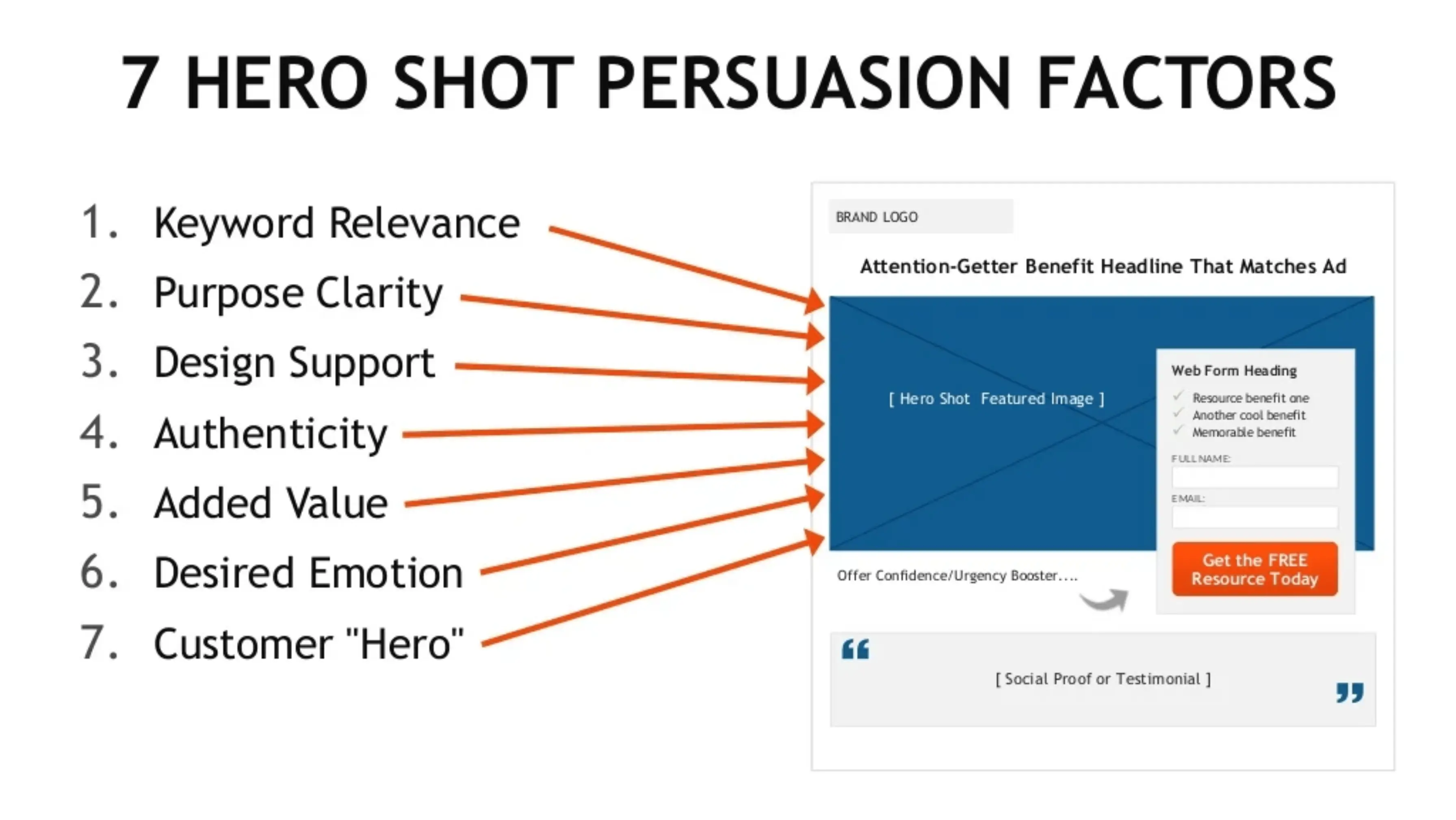
Your hero image doesn’t need to nail all seven — succeeding at three or four is often enough.
How long should an e-commerce homepage be?
There is no perfect length.
What matters most is what appears above the fold — the content visible without scrolling. Most users see roughly three screen lengths of your homepage on average.
Short pages work well for:
- Single-product stores
- Subscription businesses
Longer pages make sense when:
- Products need explanation
- You’re educating first-time visitors
- Different audiences need different messages
Every section should push visitors toward a next step:
- Browsing products
- Subscribing to a newsletter
- Reading reviews
- Following on social media
Test variations. Measure results. Optimize continuously.
Final thoughts
Designing an effective e-commerce homepage takes time — and that’s time well spent.
Focus on:
- Understanding your customers
- Clear messaging
- Strong navigation
- Purposeful visuals
Your homepage doesn’t need to be flashy — it needs to be effective. Use space wisely, experiment boldly, and never settle for “good enough.”
Boring doesn’t sell.
You’ve got this 👍
Turn your idea into a thriving business — with all the tools you need, right from the start.